Why Simple Products Perform Better Than Complex Ones
You think your massive feature list is a competitive advantage. You are wrong. It is a death sentence.
Most founders and product managers are obsessed with adding more. More buttons. More integrations. More customized dashboards. We have bought into a dangerous myth that says a product with more features is inherently more valuable.
The reality is much harsher. Every new feature you add waters down your core value proposition. Every extra menu item creates friction. While you are busy celebrating a massive new product release, your users are quietly churning because they cannot figure out how to do the one basic thing they actually signed up for.
It is time to face the facts. Complex products do not win markets. Simple, highly focused products do. Here is exactly why stripping away complexity is the ultimate growth hack for your software.
The Feature Creep Trap
Software development teams are addicted to shipping. Hitting “deploy” provides a massive rush of dopamine. It feels like progress. But shipping is not the same thing as solving a problem.
The feature creep trap usually starts with good intentions. A massive enterprise prospect says they will sign a lucrative contract if you just add one highly specific custom reporting tool. Your sales team begs for it. You build it.
Then, a vocal minority of power users requests a niche setting. You build that too.
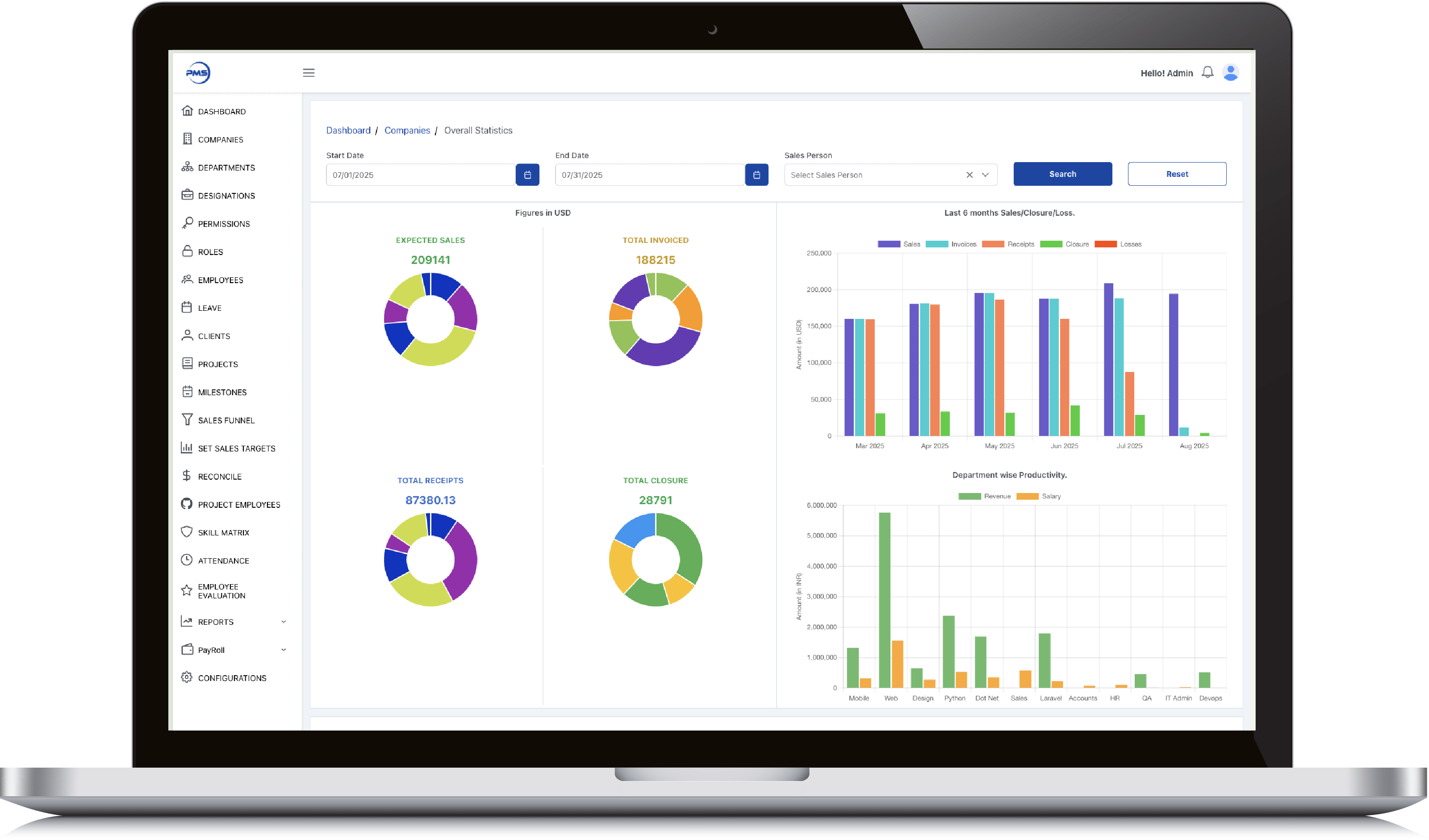
Fast forward eighteen months. Your once-beautiful, intuitive interface now looks like the cockpit of a commercial airliner. New users log in, feel instantly overwhelmed, and close the tab forever. You built a Frankenstein monster of a product by trying to please everyone. In doing so, you created an experience that pleases absolutely no one.
The Psychology of Choice
To understand why complex products fail, you have to understand how human brains work.
Psychologists call it Hick’s Law. This principle states that the time it takes for a person to make a decision increases with the number and complexity of choices available. When you present a user with thirty different configuration options on a single screen, you are not giving them freedom. You are giving them cognitive overload.
Analysis paralysis is a real threat to your bottom line. When users face too many choices, their brains simply shut down. They experience anxiety. Instead of exploring your carefully engineered advanced settings, they take the easiest path available. Usually, that path leads straight to the “cancel subscription” button.
Simplicity removes this cognitive burden. A well-designed product makes the next logical step glaringly obvious. It guides the user by the hand, removing choices rather than adding them.
Why Minimalism Skyrockets Retention
Retention is the lifeblood of any SaaS business. If you cannot keep users around, your acquisition efforts are completely useless.
Minimalist products boast dramatically higher retention rates for one simple reason. They deliver a lightning-fast Time to Value (TTV).
Time to Value is the amount of time it takes a new user to realize the core benefit of your product. If your software requires a three-hour onboarding seminar and a massive user manual, your TTV is terrible. Users will give up before they ever see the magic.
Simple products get out of the user’s way. They require zero explanation. Think about the most successful digital products of the last decade. They dominate their categories because they do one specific thing incredibly well. They do not force users to jump through hoops. This effortless experience translates directly into higher user satisfaction, fierce brand loyalty, and recurring revenue.
How to Audit Your Product for Complexity
Are you brave enough to admit your product might be too complicated? If you want to fix the problem, you need to conduct a ruthless complexity audit. Here is how you can start right now.
Track Feature Usage
Look at your product analytics immediately. You will likely find a Pareto principle situation where 80 percent of your users only engage with 20 percent of your features. Identify the features that nobody touches. These ghost features are dragging down your interface, confusing your users, and wasting your engineering resources.
Simplify the Onboarding Flow
Sign up for your own product using a fresh account. Pay attention to every single click, form field, and tooltip. How many steps does it take to achieve the primary goal? If it takes more than three clicks to reach the “aha” moment, your onboarding flow is broken. Remove mandatory tutorials and let users learn by doing. Delay asking for non-essential information until later in the customer journey.
Hide Advanced Settings
You do not have to delete every single complex feature, but you definitely need to hide them from the average user. Implement progressive disclosure. Keep the default interface incredibly clean and basic. Allow power users to dig into advanced menus only if they actively seek them out.
Kill Your Darlings
This is the hardest step for any founder. You have to delete code. Find the features that dilute your core value and remove them completely. Yes, a few vocal users might complain. Let them. Your goal is not to appease a loud minority. Your goal is to build a scalable, intuitive product that millions of people can use without a manual.
Stop Building and Start Subtracting
The era of bloated, do-it-all software is coming to an end. Today’s consumers demand elegance, speed, and simplicity.
The next time your product team sits down to plan a sprint, do not ask what you can add. Instead, ask what you can take away. Challenge yourself to solve user problems by removing friction rather than adding code.
Embrace the power of simplicity. Your users will thank you, and your revenue metrics will prove you made the right choice.
Do you have a project in mind? Talk to the experts.
Get in Touch
We’d love to resolve your queries with personalized assistance.
Contact us
Our Office
D-101/102/501/601 Titanium Square Building, Near Thaltej Cross Road, Sarkhej - Gandhinagar Highway, Ahmedabad, Gujarat 380059