BrainerHub Solutions

The Complete Data Analyst Process: Tools, Techniques and How Businesses Use Data Effectively

Data has become one of the most valuable assets for modern businesses. Companies that understand their data gain clarity, make better decisions, and create stronger strategies. A data analyst plays a central role in this process by collecting, cleaning, transforming, and visualizing data so managers and teams can act on insights instead of assumptions.

This blog covers the full data analyst workflow and the tools used at every step. It also explains how platforms like Power BI, Tableau, Excel, and Python help businesses interpret and visualize data more effectively.

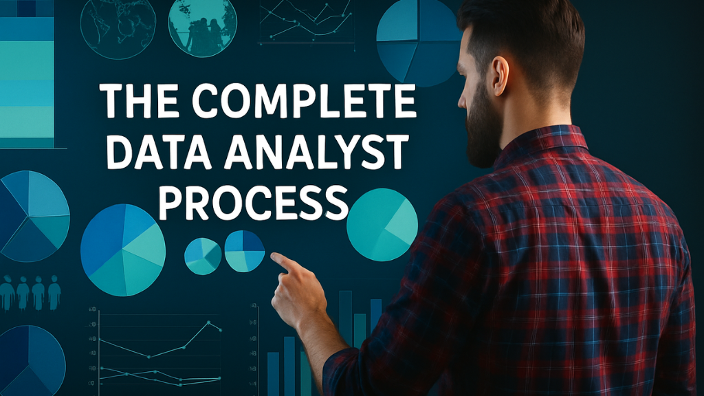
Understanding the Data Analyst Workflow

A data analyst follows a structured process that ensures data is reliable and insights are meaningful. The main stages include:

  1. Data collection
  2. Data cleaning
  3. Data manipulation and transformation
  4. Data interpretation
  5. Data visualization
  6. Reporting and decision support

Each stage requires specific tools and techniques to maintain accuracy and efficiency.

Step 1. Data Collection

Data comes from various sources such as CRM systems, websites, apps, surveys, sales reports, marketing platforms, databases, and spreadsheets. Analysts gather raw data and prepare it for the next step.

Most common collection tools
Excel files
SQL databases
APIs
Cloud data warehouses
Google Sheets

Python is often used to automate data collection from APIs or large data systems, especially when the scale is too big for manual work.

Step 2. Data Cleaning

Data cleaning is the most important and time-consuming task for analysts. Clean data ensures that insights are accurate and trustworthy.

Cleaning tasks include
Fixing missing values
Correcting inconsistent formatting
Removing duplicate entries
Handling outliers
Standardizing columns and labels

Tools used for cleaning
Excel for smaller datasets
Python libraries like Pandas and NumPy for larger datasets
SQL for database-level cleanup

Python’s Pandas library is the industry standard because it can handle large volumes of data and automate repetitive tasks.

Step 3. Data Manipulation and Transformation

Once data is clean, analysts structure it in a way that supports analysis. This includes merging datasets, creating new calculated fields, filtering segments, and preparing final tables for visualization.

Key Python libraries
Pandas for shaping and restructuring data
NumPy for mathematical operations
OpenPyXL for Excel automation
Matplotlib and Seaborn for quick exploratory insights

Excel is also useful here for quick calculations, pivot tables, and manual checks.
Power BI and Tableau can connect directly to cleaned datasets and support modeling for complex dashboards.

Step 4. Data Interpretation

Data interpretation turns numbers into meaning. Analysts identify patterns, trends, risks, and opportunities. This step helps answer questions such as:

Which product is performing the best?
Where are we losing customers?
Which marketing channel generates the highest ROI?
What is the predicted growth for next quarter?

Python helps with deeper statistical analysis, forecasting, and machine learning models.
Excel supports quick summaries and descriptive insights.
Power BI and Tableau offer interactive ways to interpret data through structured dashboards.

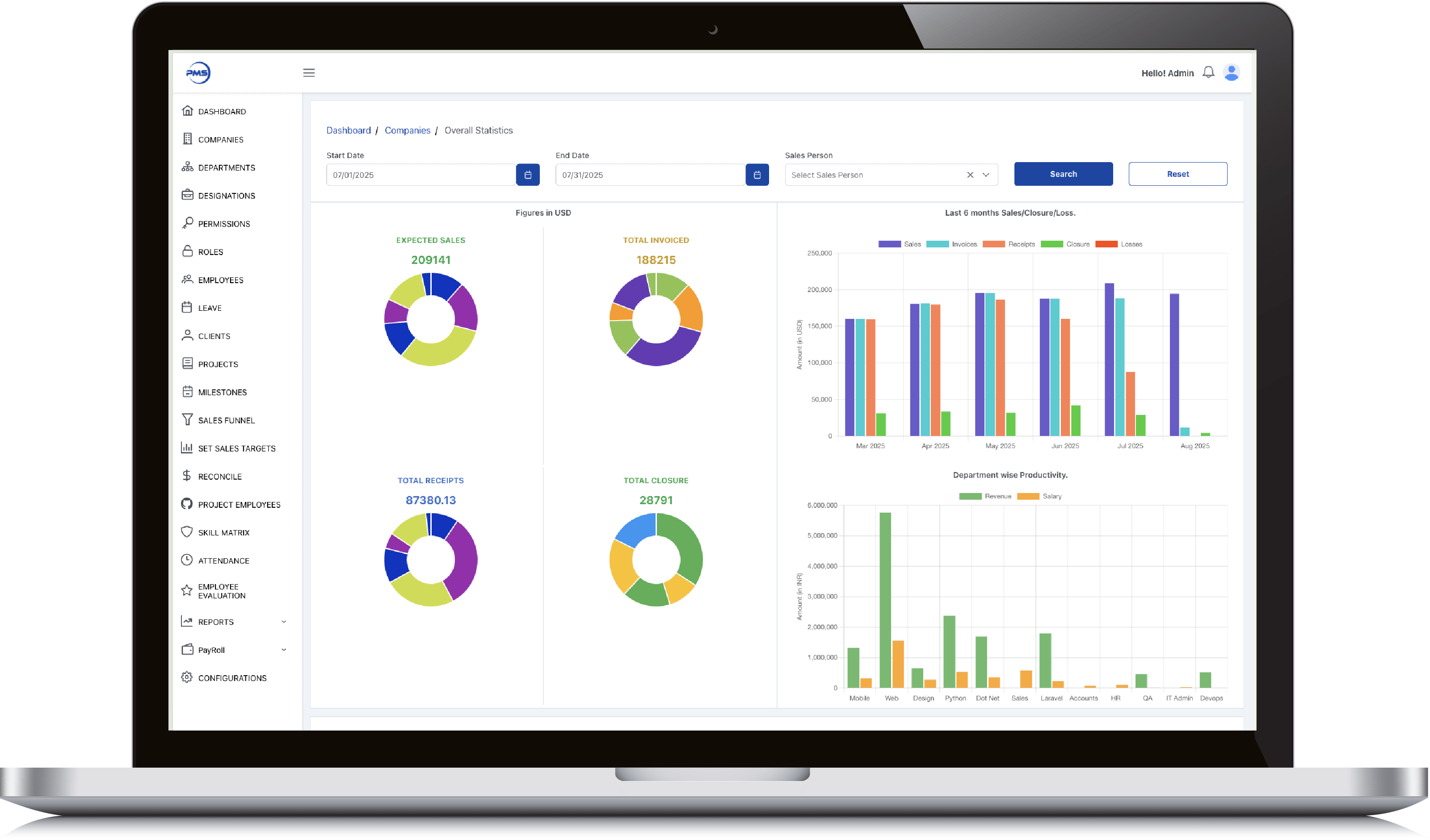
Step 5. Data Visualization

Visualization is where insights become clear. A good chart or dashboard allows decision-makers to understand performance at a glance.

Common visualization platforms
Power BI – best for business reporting, live dashboards, and cross-department analytics
Tableau – strong for deep visual storytelling and complex datasets
Excel – suitable for simple charts and reports
Python (Matplotlib, Plotly, Seaborn) – useful for custom charts, automation, and advanced visuals

Visualization transforms raw data into charts, heatmaps, KPIs, maps, funnels, and comparison graphs that reveal real business insights.

Step 6. Reporting and Decision Making

The final step is presenting insights in a format that leadership teams can act on. This can include dashboards, reports, presentations, and automated refresh systems.

Power BI and Tableau allow real-time dashboards that update automatically from connected data sources.
Excel is used for static reports that require manual review.
Python can automate recurring reports, notifications, and scheduled data pipelines.

The goal is simple. Turn data into decisions.

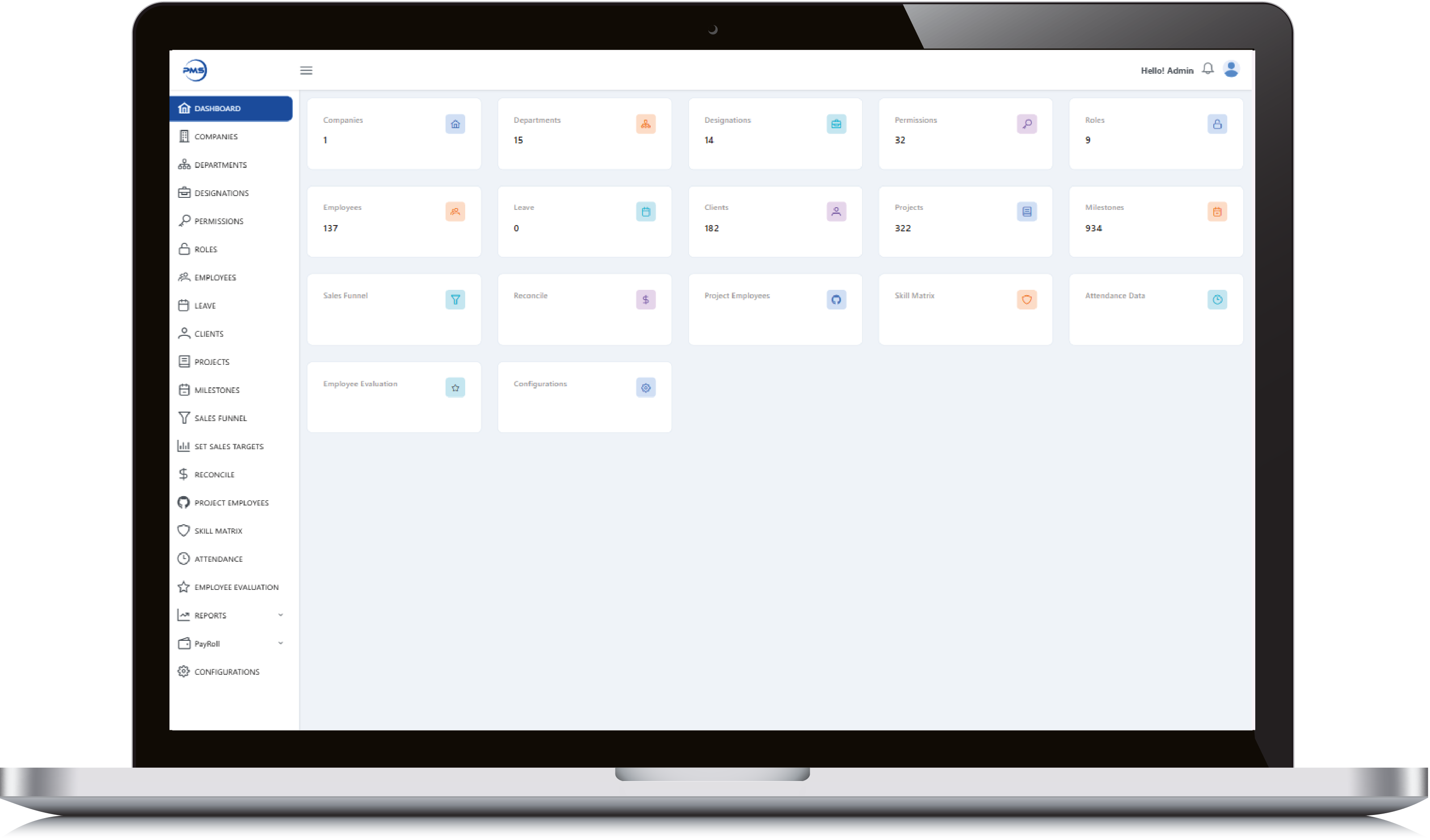
How BrainerHub Supports Data Analysis and Visualization

BrainerHub builds end-to-end data solutions that support this entire workflow. Our team works with Power BI, Tableau, Excel, Python, SQL, and cloud-based data systems to help businesses:

Set up clean and organized data pipelines
Automate cleaning and transformation processes
Build dashboards for sales, marketing, finance, supply chain and operations
Create reports that executives can rely on
Visualize complex data in simple, understandable formats
Create predictive models using Python and machine learning

We help companies move from scattered spreadsheets to structured, intelligent reporting systems.

Conclusion

A strong data analyst workflow brings clarity to a business. When data is cleaned, interpreted, and visualized properly, it becomes a powerful decision-making tool. Whether a company uses Power BI, Tableau, Excel or Python, the end goal is always the same: make decisions based on facts, not assumptions.

When the right tools and processes come together, data becomes one of the strongest assets a business can have.

Do you have a project in mind? Talk to the experts.

    +91


    Allow only .jpg, .png, .pdf (max 5MB)


    Get in Touch

    We’d love to resolve your queries with personalized assistance.

    Our Office

    D-101/102/501/601 Titanium Square Building, Near Thaltej Cross Road, Sarkhej - Gandhinagar Highway, Ahmedabad, Gujarat 380059

    Leave a Comment

    Your email address will not be published. Required fields are marked *

    Scroll to Top

      +91


        +91


        Project Management Software

        Admin Dashboard

        • Smart date and salesperson filters let you slice performance data exactly how you need it.

        • Donut charts give instant clarity on expected sales, invoices, receipts, and closures.

        • 6-month comparative bar graph reveals trends across sales, receipts, and losses effortlessly.

        • Track department productivity by comparing revenue generated vs salaries paid out.

        • View 12-month earnings history in a clean graph to support long-term financial planning.
        Admin Dashboard

        Admin Dashboard

        • Get a high-level snapshot of all key modules, from employees to milestones, in one glance.

        • Quick-access tiles let you jump into clients, projects, and departments without extra clicks.

        • Live data counts keep you updated on active users, leaves, roles, and more in real time.

        • Manage critical HR, project, and evaluation tools from a single, centralized control panel.

        • Minimalist, card-based design ensures clean navigation and quick insights for admins.
        Admin Dashboard

        Employee Dashboard

        • Evaluate employees with performance metrics across key criteria like feedback, efforts, and productivity.

        • Dynamic date and employee filters let you generate custom performance reports instantly.

        • Donut charts display category-wise and overall performance scores with clean visual clarity.

        • Track monthly performance trends through interactive, color-coded bar graphs.

        • Seamless interface ensures HR and managers can assess and compare evaluations effortlessly.
        Employee Dashboard

        Employee Dashboard

        • Track individual sales goals with a detailed breakdown of employee-wise yearly targets.

        • Quickly add, edit, or delete target entries using intuitive action icons.

        • Sort and search functionality enables fast access to specific target data.

        • Dual-tab view for switching between Yearly and Monthly targets effortlessly.

        • Clear date ranges and value indicators help monitor performance alignment throughout the year.
        Employee Dashboard

        Realinvestoo

        Admin Panel Feature

        • Intuitive dashboard gives instant insights into users, properties, revenue, and agents.

        • Real-time earnings analytics with monthly trend and pie chart breakdown.

        • Smart revenue categorization by Boost, Banner Ads, and Subscriptions.

        • Fully manageable CMS, banners, blogs, messages, and subscriptions from one panel.

        • Role-based user tracking: buyers, sellers, and agents with total user count.
        Admin Panel Feature

        Admin Panel Feature

        • Seamlessly manage every listed property with edit, view, and delete at your fingertips.

        • Smart filters, real-time search, and draft visibility make property management effortless.

        • Instantly track property type, status (Sell/Rent/Lease), location, and views in one clean table.

        • Admin-level control with instant updates across 69+ properties, scale made simple.

        • Visual status tags (Sell, Lease, Rent) make portfolio oversight intuitive and quick.
        Admin Panel Feature

        User Feature

        • Personalized dashboard with user greeting and clean UI.

        • Discover top-rated properties with location and availability.

        • Highlighted featured listings with price, stats, and lease tag.

        • Easy bottom navigation for home, search, add, chat, and profile.

        • Detailed property cards with date, location, and images.
        User Feature

        User Feature

        • Powerful property search with location-based results.

        • Clear Sell, Lease, and Rent status tags on listings.

        • Favorite/heart feature for saving preferred properties.

        • Compact listing cards with area, beds, baths, and view count.

        • Integrated price display for instant decision-making.
        User Feature

        Food Delivery App

        Admin Panel Feature

        • Live Order Tracking get real-time updates from order placement to delivery.

        • Vendor & Menu Management  add, edit, and organize menu items with ease.

        • Flexible Commissions & Analytics set vendor rates and monitor sales performance.

        • Review & Feedback Control approve, reject, or reply to customer reviews.

        • Promotions & Campaigns create and schedule discounts, coupons, and offers.
        Admin Panel Feature

        Restaurant Panel Feature

        • Live Order View to monitor incoming, in-progress, and completed orders in real time.

        • Menu & Price Editor for quickly updating dishes, descriptions, and pricing.

        • Discount Engine to create, schedule, and manage promotional offers.

        • Delivery Settings to control service areas, timings, and delivery charges.

        • Revenue Dashboard with instant sales, earnings, and performance stats.
        Restaurant Panel Feature

        Delivery Partner Feature

        • Instant Alerts for new orders, status updates, and important notifications.

        • Smart Navigation with integrated maps for fastest delivery routes.

        • Earnings Tracker to view daily, weekly, and monthly income.

        • Status Management to update availability and delivery progress in one tap.

        • Shift Toggle to go online or offline as per delivery schedule.
        Delivery Partner Feature

        Customer App Feature

        • Smart Location Detection  Accurately match with nearby restaurants and delivery options.

        • Intuitive Search & Filters  Quickly find meals by cuisine, price, or ratings.

        • One-Click Cart & Checkout  Review orders and pay securely in seconds.

        • Detailed Restaurant Profiles  View menus, ratings, and contact information easily.

        • Easy Custom Orders  Personalize dishes before placing your order.
        Customer App Feature